Teaching
Typography Design lab 1
COURSE description
This course is an introduction to the fundamentals of typography, exploring experimental approaches of letterform construction and terminology and developing a sound understanding of all components related to typographical composition and design practices. Projects, demonstrations, lab, lecture and critiques.
COURSE LEARNING OBJECTIVES
– Master the construction of letterforms through practical projects, emphasizing diverse styles and techniques.
– Develop a rich vocabulary in typography, understanding key terms related to letter anatomy, font classification, and design principles.
– Acquire a solid grasp of components like typefaces, leading, kerning, and hierarchy, enabling effective and visually appealing design compositions.
– Engage in critiques to refine critical thinking skills and provide constructive feedback on both personal work and peer projects, fostering continuous improvement in typographic design.
Kyra Beck
Kelly Brenner
Katera Burrows
Kelly Coll
Megan Connell
Esther Consuegra
Leo Cruz
Ale Flores Ermecheo
Jaden Head
Maria Marcos
Ayana Milbank
Alexandra Marie Moiseyev
Julia Molina
Kirlan I Moreno Lopez
Yasmin Paniagua
Ethan Peraza
Lucas Rouille
Isabel Ruiz
counterspace
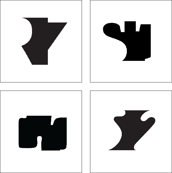
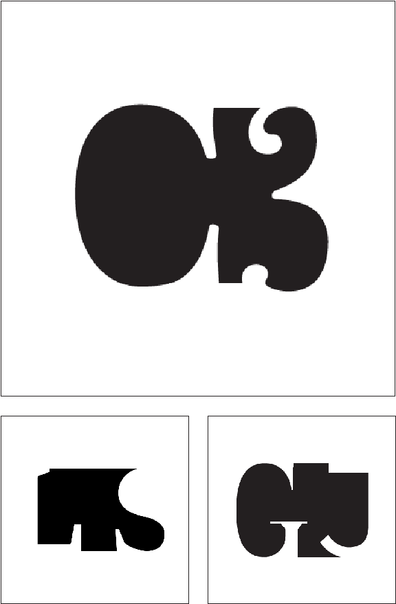
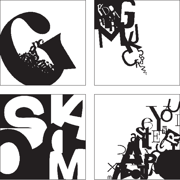
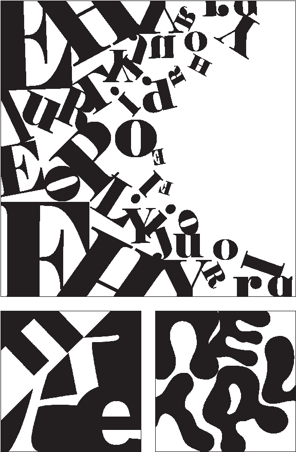
In this assignment, the primary focus is on the central black figure, with viewers gradually noticing the letters forming it on either side. The key tension arises from the shift between perceiving the black figure and recognizing the letterforms. Students are allowed to use up to two letterforms, ensuring each retains its distinct identity while keeping their standard orientation. However, the spacing between the letters can be adjusted to enhance the visual effect.
figure/ground ambiguity
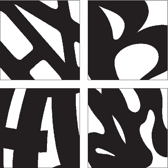
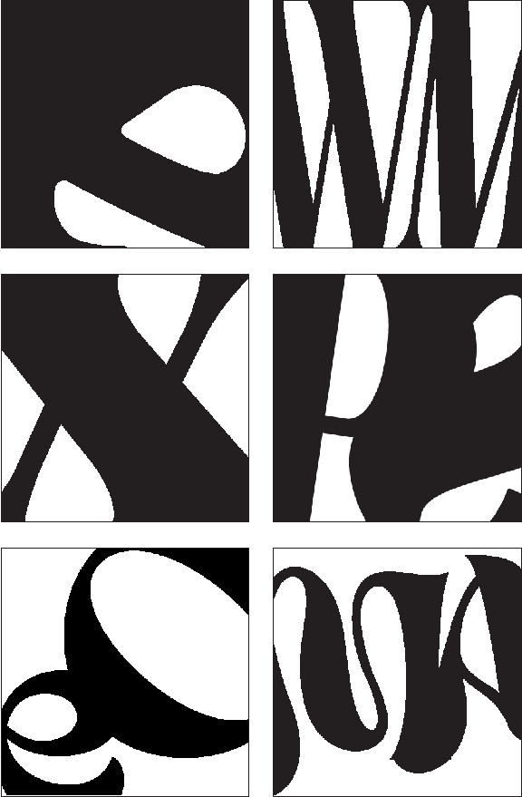
This exercise focuses on creating figure/ground ambiguity, where the letterforms shift between familiar and unfamiliar, working to compositionally engage the surrounding space. Students are tasked with making the letterform appear as a white shape on a black background while preserving its identity. They may use a maximum of two letterforms, ensuring each retains its distinctive character.

figure/ground harmony
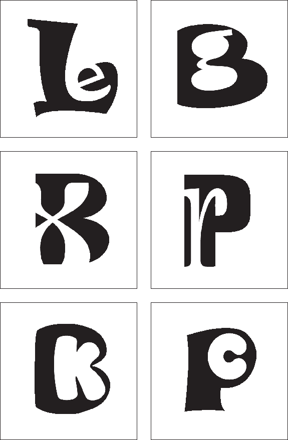
In this variation, students combine a single white and black letter, where the white letter is “reversed-out” of the black one. Essentially, the black letter serves as the ground for the white letter. While any letter combination can achieve this, the most successful designs will find natural harmonies between the shapes of the letters. Students may use a maximum of two letterforms, ensuring that each retains significant individual identity, while maintaining their standard orientation.

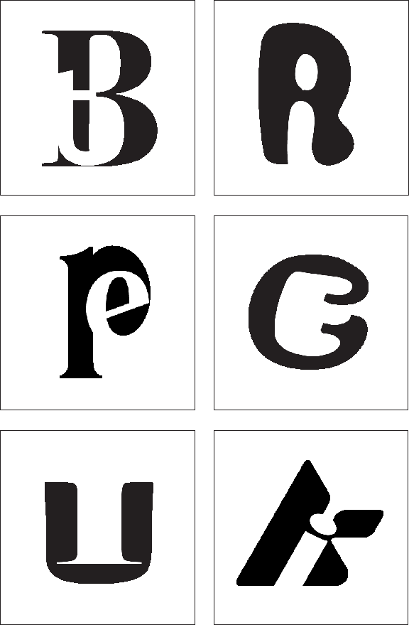
letterform combination
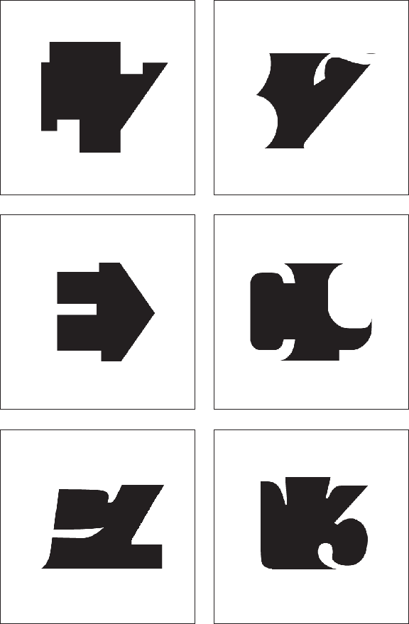
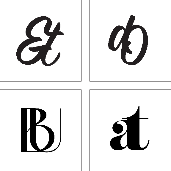
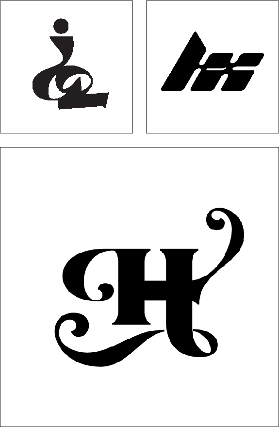
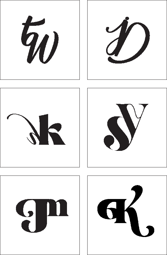
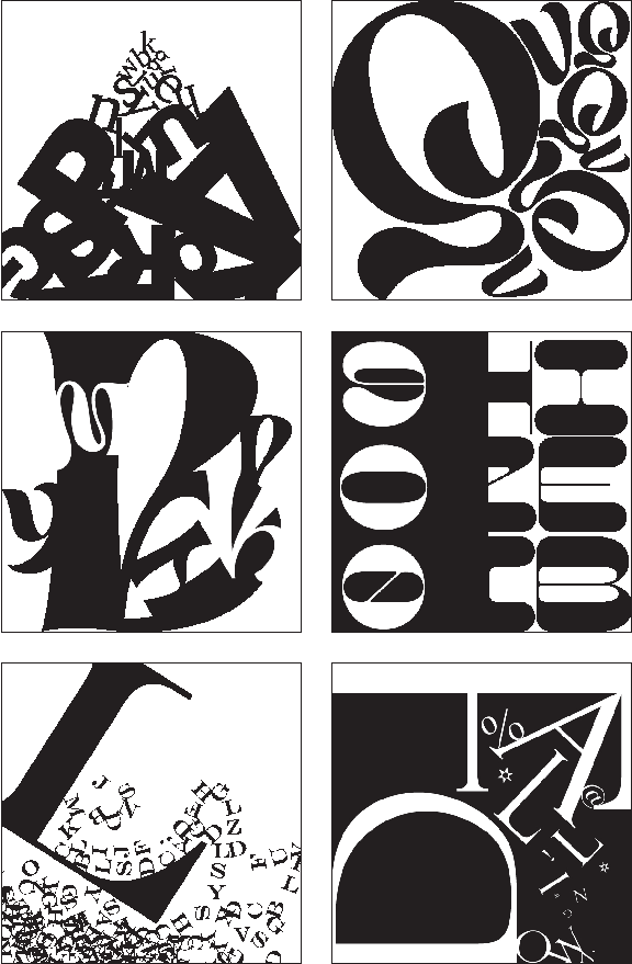
In this letterform combination exercise, the challenge is to blend two or more letters and symbols to create an entirely new character. Students will explore how to harmoniously combine letterforms to develop a unique and cohesive identity. A maximum of three letterforms or punctuation marks may be used, with each element contributing to the creation of a new, unified character that stands apart from its original components.
letterform composition
In this exercise, students use letterforms to create visually compelling compositions. While figure/ground relationships remain important, the focus shifts away from making it central. Instead, the emphasis is on exploring how to use type as the essential element to craft engaging and dynamic compositions, concentrating on balance, harmony, and visual impact through letterforms.
color
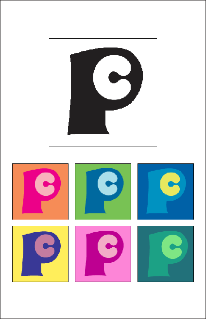
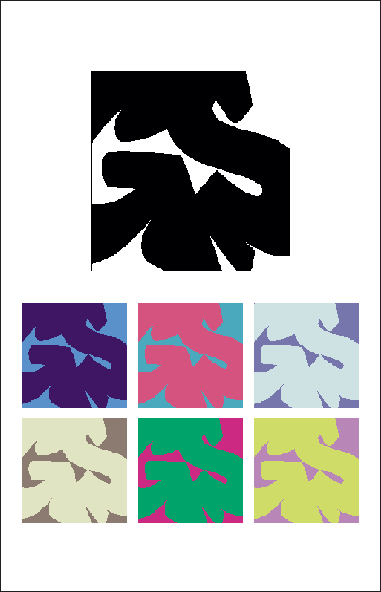
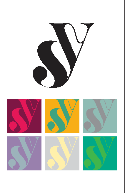
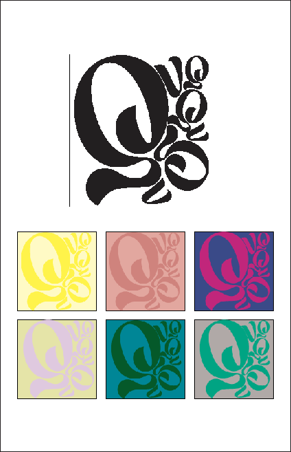
For this exercise, students selected one of their approved sketches and explored various color schemes. They created six different versions of the same design, using contrasting colors to examine the impact of color changes. By applying their knowledge of color theory, students aimed to create designs that communicate effectively through the strategic use of color.
Design Typography poster
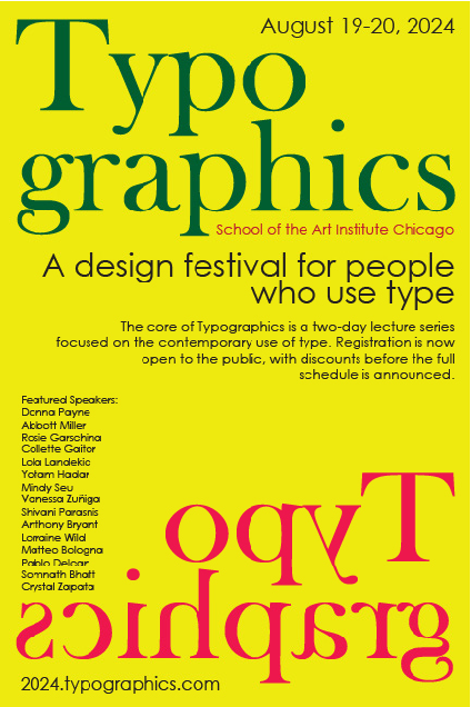
In this project, students applied the typographic principles learned in the initial exercises to create a poster for a type conference. They focused on developing a clear layout and typographic hierarchy, utilizing type as the main visual element to convey the message effectively.
Kirlan I Moreno Lopez
Esther Consuegra
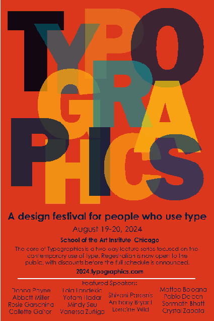
Kelly Brenner
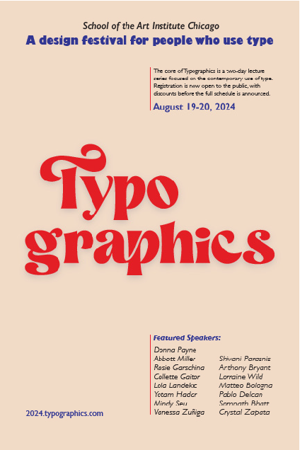
Katera Burrows
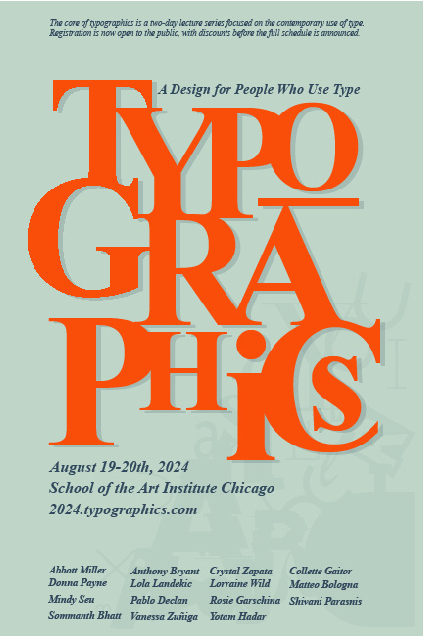
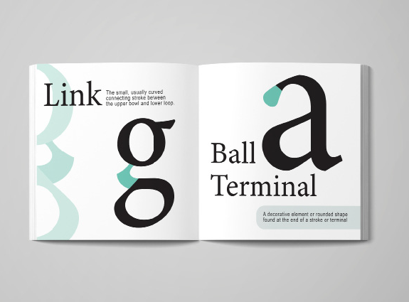
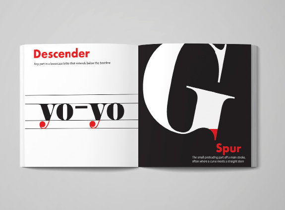
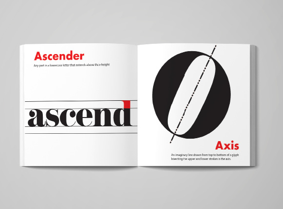
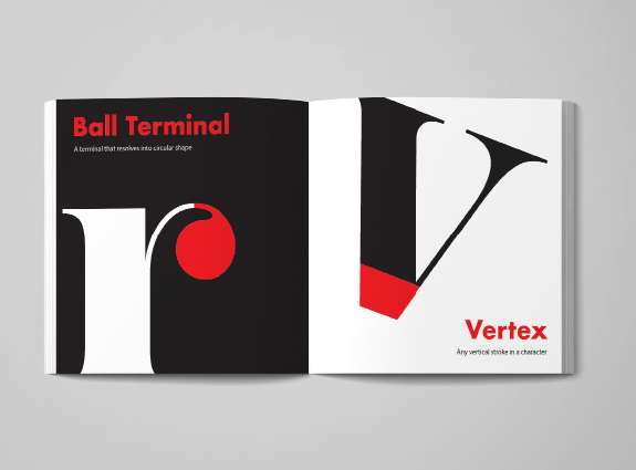
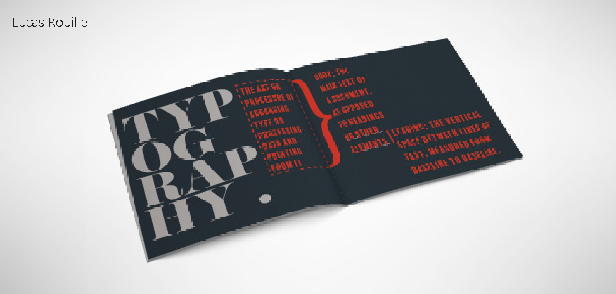
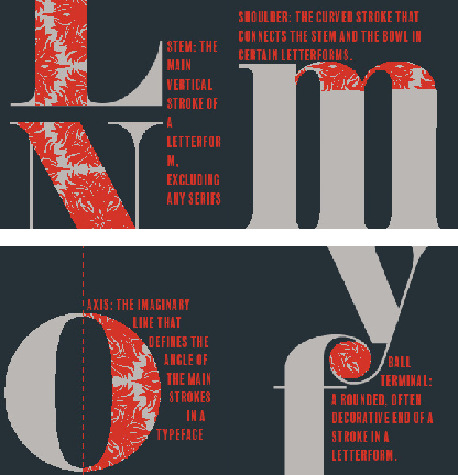
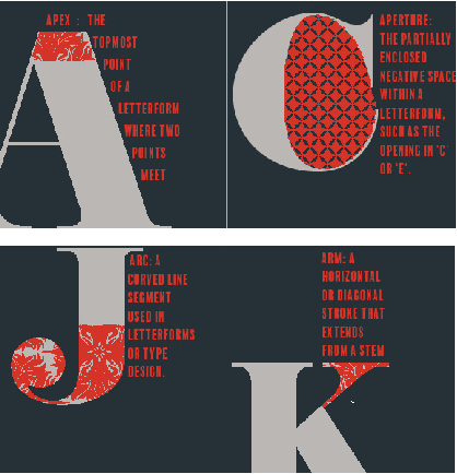
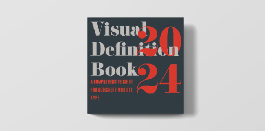
Visual definition Book
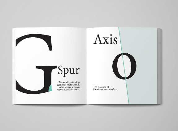
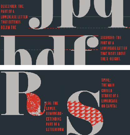
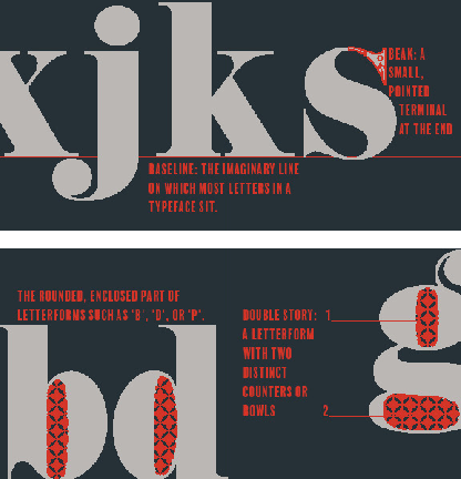
In this project, students designed a visual definition book using visual cues to define terms related to letterform anatomy. By focusing on the different parts of letters, students gained a deeper understanding of type and type design, learning to distinguish key characteristics without relying on text.
Kelly Brenner
Esther Consuegra
Visual Design lab 1
COURSE description
Visual Design Lab 1 is an intensive course that immerses students in the foundational principles and practices of graphic design. Through hands-on projects, interactive discussions, and exposure to industry-leading resources, I help students to develop a strong understanding of design principles and concepts. This course aims to equip students with the skills and knowledge needed to begin their journey towards becoming a professional graphic designers.
COURSE LEARNING OBJECTIVES
– Understand the fundamental principles and elements of graphic design.
– Gain proficiency in industry-standard design tools
– Cultivate a creative and critical mindset to effectively communicate visually
Abeer Alquran
Willianny Antonio
Jeremiah Cemoin
Savana Claxton
Natalie Handwerk
David Lopez
Jeyra Mendez
Idaris Naphakorn
Luana Smith
Vanessa Tamayo
Ashley Terzado
Michael West
Alexa Francis
Point
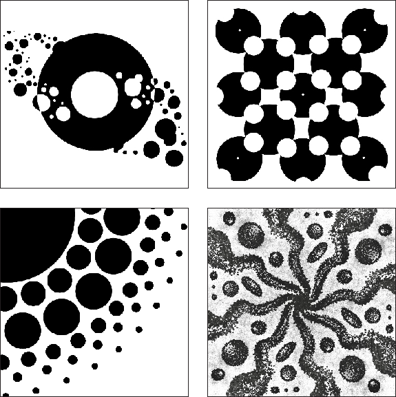
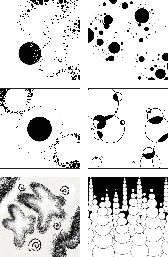
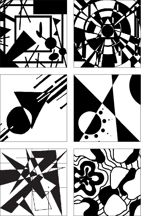
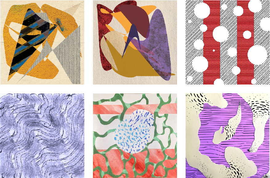
The objective of this assignment was to develop an understanding of composition design principles. Students explored the effective use of points as a fundamental element in visual design.
Line
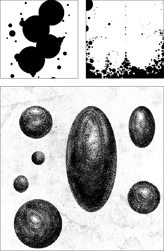
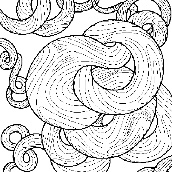
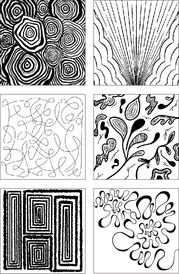
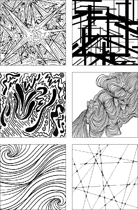
The objective of this assignment was to develop an understanding of composition of design principles. Students explored the expressive potential of lines in visual design.
Shape
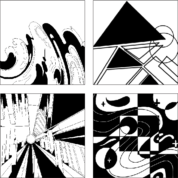
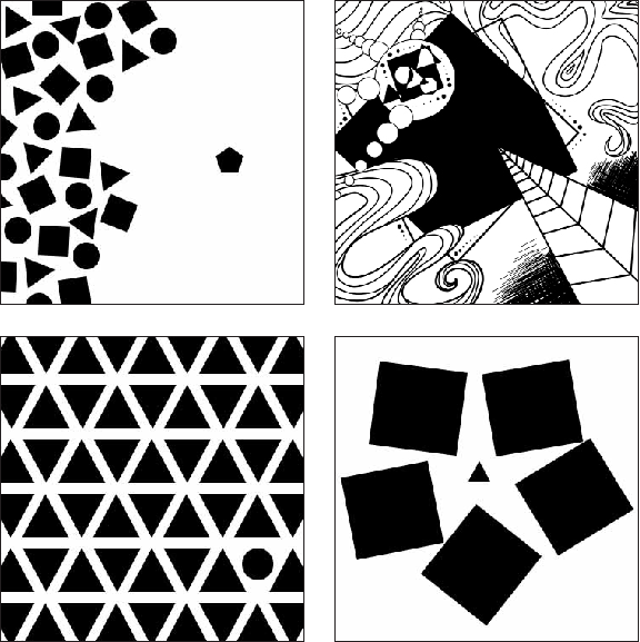
This assignment focused on enhancing students’ understanding of primary shapes in graphic design. They experimented with various compositions, emphasizing simplicity, contrast, and visual impact to convey messages effectively.
Shape, Line and point
This assignment focused on enhancing students’ understanding of shapes, lines, and points, exploring their use in graphic design to convey visual impact, mood, and message.
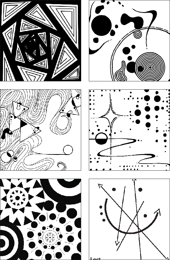
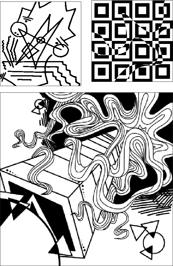
Pattern/Texture
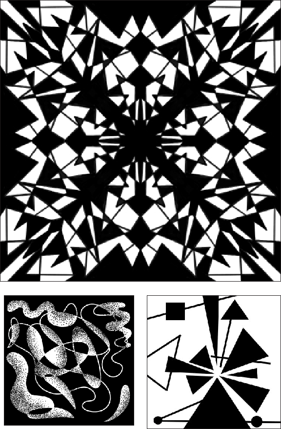
This assignment is designed to help students develop a stronger understanding of composition principles by focusing on the creation and manipulation of patterns and textures in visual design. Through this process, students will explore the relationship between different design elements—such as line, shape, color, and form—to create patterns that convey texture, rhythm, and depth. The aim is to push creative boundaries and experiment with how patterns can be used to communicate visually and evoke various responses from the viewer.
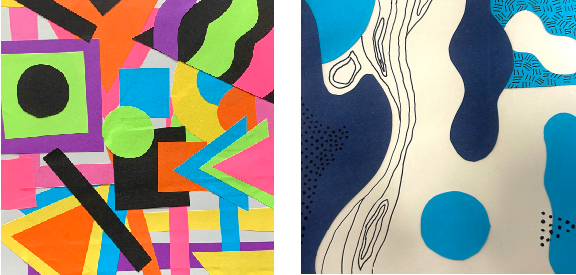
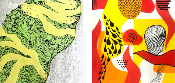
Form-Space-Value
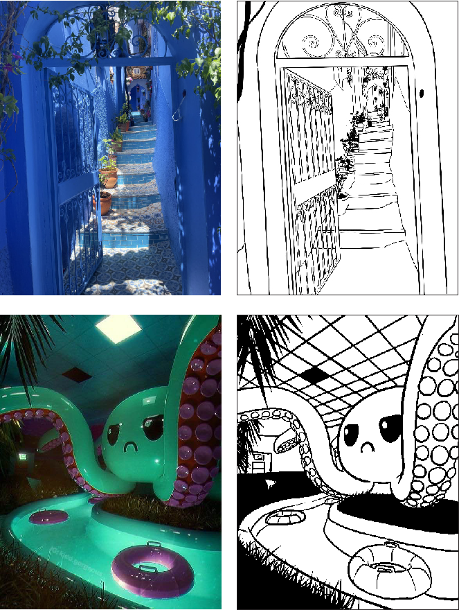
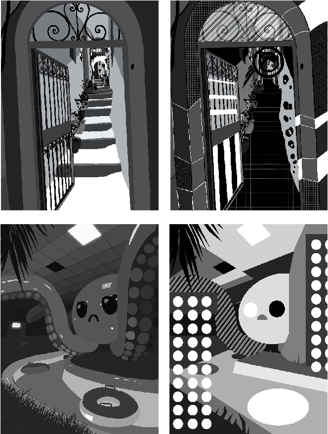
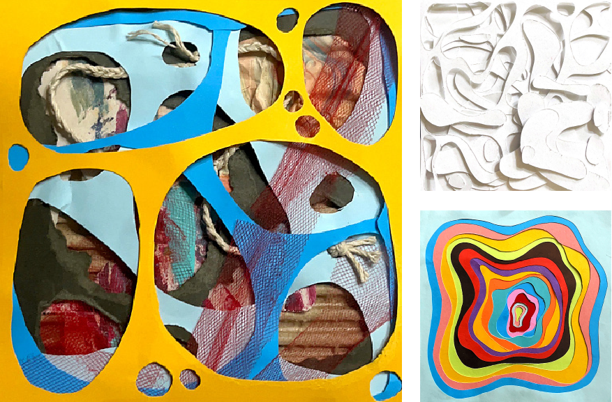
This assignment is designed to help students understand and apply the fundamental principles of form, space, and value in visual composition. By deconstructing an image into its simplest shapes and manipulating positive and negative space, students will explore how these elements interact to create balance and structure. Through the use of grayscale values, they will also learn how to illustrate depth and perspective, adding dimension to their work. The final stage encourages creativity by allowing students to alter and transform their compositions, ultimately producing a unique piece of artwork that demonstrates a clear understanding of these core design principles.
